Branding case study
Dillish Cosmetics Branding
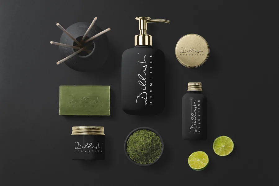
Dillish Cosmetics is a premium beauty branding and packaging direction designed to feel calm, credible, and shelf-ready. The system focuses on product family consistency, tactile packaging presence, and a visual language that supports skincare, spa, wellness, and beauty retail communication.
Design Strategy
Beauty branding needs immediate trust. The identity route uses restrained colour, elegant contrast, clear product hierarchy, and packaging mockups that make the brand feel established. The goal is to help the product feel premium online, in social content, and in physical product presentation.
Lead-Generation Value
For product businesses, strong packaging design can directly affect enquiry quality, retail interest, and buyer confidence. A well-built identity gives the founder a system for labels, boxes, product photography, web design, pitch decks, and launch campaigns.
- Beauty logo design and skincare identity direction.
- Premium packaging system and product mockups.
- Colour, hierarchy, and shelf credibility strategy.
- Designed for launches, retail interest, and online trust.