Brand identity case study
Atlantic Edge Brand Identity
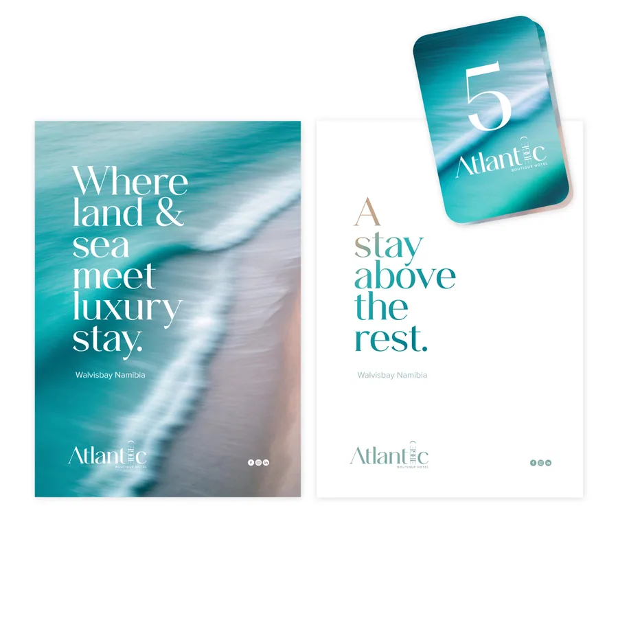
Atlantic Edge is a hospitality brand identity route built around coastal restraint, boutique confidence, and a premium guest-facing campaign language. The design direction uses a calm but memorable visual system so the brand can feel polished across logo applications, digital presence, print, signage, and launch material.
Design Strategy
The identity needed to avoid generic beach-hotel language. The route leans into a sharper coastal feel: clean hierarchy, oceanic colour behaviour, restrained luxury, and a campaign rhythm that can work for accommodation, events, restaurant moments, and destination storytelling.
Lead-Generation Value
This type of brand identity helps a hospitality business look more trustworthy before a guest reads the details. A clear CI system makes photography, social media, booking pages, menus, brochures, and signage feel connected, which supports higher perceived value and stronger enquiry confidence.
- Hospitality logo and brand identity direction.
- Premium coastal colour and campaign language.
- Mockup system for launch and guest-facing touchpoints.
- Designed to support bookings, trust, and brand memory.